-
Font Archive
- Helvetica Neue
- Myriad
- Rockwell
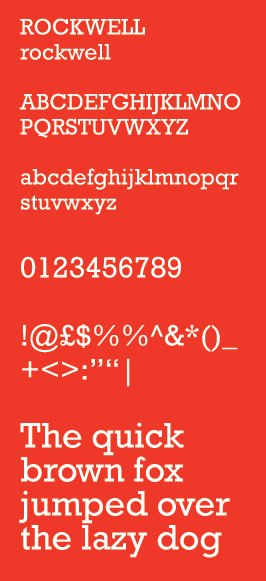
Rockwell is a serif typeface belonging to the classification slab serif, or Egyptian, where the serifs are unbracketed and similar in weight to the horizontal strokes of the letters. The typeface was designed at the Monotype foundry's in-house design studio in 1934. The project was supervised by Frank Hinman Pierpont. Slab serifs are similar in form and in typographic voice to realist sans-serifs like Akzidenz Grotesk or Franklin Gothic. Rockwell is geometric, its upper- and lowercase O more of a circle than an ellipse. A serif at the apex of uppercase A is distinct. The lowercase a is two-story, somewhat incongruous for a geometrically drawn typeface.
Because of its monoweighted stroke, Rockwell is used primarily for display rather than lengthy bodies of text. Rockwell is based on an earlier, more condensed slab serif design called Litho Antique. The 1933 design for Monotype was supervised by Frank Hinman Pierpont.
The Guinness World Records used Rockwell in some of their early-1990s editions. Docklands Light Railway also used a bold weight of this typeface in the late 1980s and early '90s. The New York Times uses a similar typeface, Stymie Extra Bold, for the headlines and some other typographical uses in its Sunday magazine. The letterform of Stymie Extra Bold's lower-case "t" is highly geometrical, whereas Rockwell's Extra Bold has a rounded letterform. The ascender of the Rockwell "t" is also cut at a sharp angle not to be found in the Stymie typeface. The Konami arcade game beatmania III features Rockwell as the typeface used for song titles.
ITC Lubalin Graph, designed by Herb Lubalin, is a slab-serif version of ITC Avant Garde that resembles Rockwell.